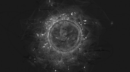
Software as art. This is an issue that every digital designer longs to achieve in one form or another.  One would think that by 2009, galleries would be exploding with AI created designs projected on huge screens or walls.  Instead they are filled with found junk art and heavily laquered pieces that could have been done sixty years ago.  The problem is money.  How is a gallery going to market or even sell these “software” pieces?  If a gallery can’t figure out a way to sell these pieces, it usually gets thrown under another category- Performance Art.  And most of the time these end up as paid events, or at a museum.
Which brings me to my next thought. Do you have to have a 20 page thesis for something that just looks pretty? Everytime we see a digital piece, we get bored with the story way before we even get to the compostion. One could argue that this is part of the piece; but that is usually the artist.  When I do a spot for television or even a painting, I have many inspirations.  Do I need to list them out as subtitles so the viewer gets it?  Did Dali or Picasso write a structured thesis on their greatest works?  The titles and short blurbs used to be enough; and some would argue still are.
So… Software as art.  This is what Casey Reas explores in a recent comission for the Whitney called {Software} Structures. Casey implements and reinterperets three of Sol LeWitt’s works into software based compositions.  Sol LeWitt is a conceptual minimalist american artist who was best known in the Late 60’s.Â
Here is an exerpt from Casey Reas about the pieces:
“Without diverting into a didactic text about Structuralism, I will simply state that a structure is a relationship among elements. Within disciplines such as linguistics and anthropology, structures exist but are open to re-interpretation, but in computer science, structures are by necessity extremely precise. Computers are machines designed for their reliability and accuracy and while these characteristics make computers valuable to the scientific and engineering communities, they are not necessarily important characteristics for an artist. Artists such as Takashi Murakami use the computer as a precise tool, but it’s not possible to imagine the work of Anselm Kiefer put through the filter of a precise computing machine…”
Boring.
I go to alot of museums and to many gallery openings on a weekly basis. And I have to say that digital artists write the most boring unbelievable shit. I used to be one of those artist/writers/waiters/teachers. Â After you scan over the various links and sub-links on the explanation site, you get to the heart of the art; and it is beautiful. Â Click through the thumbnails and have a look. We found that mouse movements create a slight change to each piece, which is a nice touch.
Click Here to View {Software} Structures
Take Away
This is the kind of work I love to look at on a Sunday morning to get my mind working in new creative ways for the week ahead.  I just wish we as digital designers, didn’t feel the need to over explain ourselves so that people would understand our work.  I have learned recently that a visual representation is the best way to get creative ideas across to other people. Lengthy write ups get glazed over as art-speak, even if they are written with the best creative intentions.


WHAT TO DO NOW?